Q & A
- Linda Gilbert
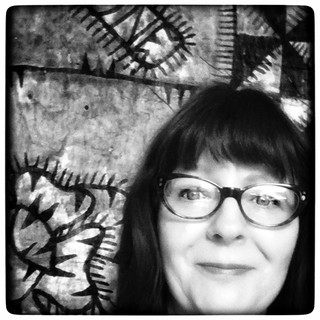
- Mar 8, 2021
- 19 min read
Updated: Sep 1, 2022

What do you do? What sort of things do you make or capture? Or select?
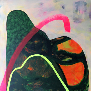
I describe myself as an abstract, biomorphic painter. I make acrylic and gouache paintings on various substrates (including plywood, canvas, paper and digitally). I work in layers and combine digital and analogue tools within my practice. My paintings are responses to shapes I see and emotions I feel, in nature and within urban environments. I attempt to reflect the energies I feel at the points where urban and rural environments meet.
I am developing my own visual language that has evolved around 3 'E's': the Environment, edges (real and metaphorical) and equity.
Environment
For me this could mean the Earth, the place I live, a specific site or a combination of all of these. I consider the idea of 'environment' from an ecological and anthropological perspective, and as energy that I tap into. How are humans treating the Earth? What vitality or lifelessness does the place hold that I can sense? The idea of the environment often appears in my paintings in relation to the colour palette I use and through biomorphic shapes. I am attracted to environments that are opposites of each other, for instance rural and urban, industrial and agrarian.

Edges
In my practice, edges can be painted shapes abutting each other on a canvas or in drawings, or a long line of cut and painted rockstock paper in a chaotic heap on the floor of a gallery (see images below). I have a tendency to use pink builders line to denote edges too - I think of this material as a nod to urban or industrial activity. Lines are elements within my paintings and I consider these to be edges. I learnt Pitman's shorthand and calligraphic lines are edges I use when mark making. I think about edges in the way I display work and how it is read. These are the practical ways I use edges in my practice.
Edges can also be concepts for ideas that nurture my practice. They can be the places within a landscape that I find curious. I am particularly intrigued by points where rural meets urban such as roads, motorways, bridges, connecting paths, grass verges, hedgerows etc. These are transitional places that hold a sense of liminality. They are neither here nor there. Sometimes full of potential and possibility, at other times just a sad no man's land.
The concept of the 'edge effect' comes from ecology and refers to the changes in population or community structures that occur at the boundary of two or more habitats. This concept is also used in psychology as a metaphorical landscape for the way a person is feeling. It can denote being in-between, neither here nor there, living two different lives, etc. In psychological terms people understand what it means to 'be on edge'.
Living in Aotearoa, a series of small Pacific islands at the bottom of the planet. Constant earthquakes and risk of tsunamis - these realities reinforce the idea of edges.
I use edges and the edge effect as literal and metaphorical devices both in the practice of painting itself and as a concept I tap into around liminal and psychological states.


Equity
When you stand in front of my work it may not occur to you that I am motivated by the values of equity and fairness. There is usually nothing obvious in the work I make. Nor do I position myself as an advocate or political painter. However equity is integral to the way I process ideas, think about discrimination, economic or social inequities relating to humans, but also in matters to do with fairness to the planet and our environments. I consider equity to be a strong principle that informs my practice. These ideas can also be seen in my writing - eg. refer to the blog above called 'Equity and the power of art'.
An example of a painting that talks about is 'Gold and Grit'. I painted this in 2018. I was thinking about the ostentatious wealth parading itself against abject poverty I saw walking down Karangahape Road each day to art school (eg. a Tesla parked in front of a group of homeless people sleeping rough).
Biomorphic, organic shapes refer to the natural environment, while neon colours, pink threads and sharp lines tend to refer to urban settings.
I enjoy using pink and see it as a way to reclaim it from its historically feminine context. To me it represents curiosity, optimism and a sense of resilience. When I was young neon colours were all about freedom and happiness. Ironically, these days they alert us to danger and are the colours of health and safety.
Pink is also one of the colours used in builders' line, which I frequently incorporate into my practice. I am aware that pink can have many other connotations and while I have my own set of definitions, I realise this is by no means universal.
I'm interested in the intersections and edges where urban meets rural, and vice versa. To me these are liminal spaces full of potential. I sense particular energies at these points and I am acutely aware of the magnetic energy of the Earth. I think about the equity issues, or fairness, of humanity imposing itself on the Earth and the impact that has.

What is it you've been trying to do to make the work relevant in relation to ideas, cultural circumstances or contemporary issues?
Liminal spaces and notions around physical and psychological thresholds (edges) intrigue me. These relate to living in and making art at the end of the Anthropocene, and in this new era of COVID.
The Anthropocene is a topic of great discussion in contemporary society. Many artists are working with ideas around ecologies of space and place. The concept of the Novacene recently published by Sir James Lovelock also informs the backdrop to my practice. According to Lovelock, this is the new epoch we are transitioning into where humans will no longer dominate and the Earth will redress the balance in order to survive.
I make paintings that celebrate the magic of everyday phenomena too. That was the focus of my last solo show 'Magnetic fields under neon skies', held at the Wallace Gallery in Morrinsville in September 2020. We are surrounded by wild colours and experience subtle energy fields everyday. These energy fields fascinate me. Sunsets, the auroras, even rainbows are mind-blowing when looked at afresh. Valuing what can be taken for granted is also a way of raising awareness about the state of our planet.
How do you make decisions during the making of your work? How and why do you select the materials, techniques, themes that you do?
Decisions and process
iPhone Photography is a big part of my practice. I use it to capture interesting shapes, colours and forms in my everyday environment. It's all about noticing and documenting.
The photographs are mainly abstract and often inform ideas for paintings. Decisions are made at an intuitive level when I'm painting. I tend to paint in a gestural style and when the paint flows I go into a state of flow too.
Then I'll photograph the painting and manipulate it on my iPad. This is usually an evening pastime while listening to music or watching tv. I find having this other media interference useful as it stops overthinking. It is play time with no paint wasted. The next day I review and see if any jump out or I think could work. I consider value (the lights and the darks. Sometimes I will print a black and white photocopy to see where the values lie), composition (how my eye travels around the work), and colour. This part of the process is akin to drawing for me and very experimental.
From there it's back into the studio with a rough idea of where I'm headed. Inevitably the painting takes me on another path! But I like this process because it gives me confidence for the next steps as the painting is developing.
Materials, techniques and themes
Rockstock paper
I tend to work on rockstock paper because it is aesthetically pleasing, weighty and (apparently) environmentally sound. It is made of calcium carbonate and a fairly inert plastic glue and can be recycled. It has a smooth surface similar to the slip of the iPad. I like that because it means I work quickly and can outpace the chatter of the inner critic.
Canvas, acrylic paint and gouache
I adore the bounce of a paintbrush on a taught canvas, but I find canvas problematic because it is prone to damage if not handled with care. I am also interested in scaling up and canvas does not really seem practical for what I have in mind.
For my BVA graduation show I made a large canvas print from one of my original paintings then cut it up into random shapes that I collaged onto new stretched canvases which I then painted on. I enjoyed turning my own work into something new. I have no qualms about painting over my earlier paintings either. These disruptive and destructive approaches are counterpoints to the heavy weight of history held in the material of the canvas.
I am continually searching for more innovative and practical ways to paint. Recently I began working on plywood panels. They are sturdy and construction like. There is something sculptural about them. I chose 700 x 700mm squares as a nod to Instagram digital culture. I may or may not make them into something practical one day... but the option is there.
Charcoal
Charcoal is a material I return to. Maybe it's the honesty of it and the fact it gives an interesting, gritty look to the work. I like to think it connects to the idea of equity I'm so concerned about. I use it as a drawing tool and then brush it gently to get a painterly look. Then it must be fixed to avoid smudging.
Techniques
My graduation show at AUT was called 'Slip and bounce: adventures in surface tension'. This was a reference to using analogue and digital surfaces within my practice. It was also referring to the themes I was (and still am) dealing with - around the surface of the Earth.
Iphone photographs are a useful point of entry and I use the phone like a sketchbook. I simplify the images and draw on rockstock with acrylics and gouache and sometimes charcoal. Or I might use the abstract photographs as the basis for digital drawings.
When I start painting, layers and glazes are used to push and pull the eye through time and space.
Sometimes I draw in shorthand using charcoal on the gessoed surface then add layers of glaze over the top. I like the idea that there is a poem or a feeling lurking beneath the surface that inspires the work. Glazing allows you to see snippets of what has gone before, like an archaeological site that can be excavated, there is a sense of time taken. This slow process also slows me down and I use it to stop myself overworking a painting. I usually have a number of paintings in progress at the same time. This allows for excess paint to be used up and takes away the pressure that there is 'the one'.
I keep a sketchbook where I write down certain techniques I've used or colour recipes, ideas, references to books and articles, etc. My sketchbooks are rough, tools of the process. I envy artists who have pristine, beautifully presented sketchbooks that are works of art in their own right.
My style of painting seems to align to a contemporary version of American Lyrical Abstraction. This incorporates an intuitive and loose paint handling with spontaneous expression. It came about in the 1960-70s after Minamalism, and heralded the way towards a more freer expressionism. It focused on process, new materials and new ways of expression. Lyrical Abstraction aimed to create a more direct physical and sensory experience and was a a reaction against conceptual and hard edged painting styles. Painters I look at from the past who worked in this way include: Helen Frankenthaler and Sam Gilliam.
Each stroke I make is intuitive and that creates a dialogue with the substrate and I continue from there. I use fine lines and drawing techniques with paint as quiet counterpoints within the image. Artists such as Joan Miro and Julie Mehrutu (who paints large scale abstract landscapes overlaid with architecturally inspired abstract drawings), also use these techniques.
I was once advised to choose between colour and line. I refuse to do that - in my practice there is a place for both.
Themes
Environment, Edges, Equity
I constantly return to the the 3 E's discussed above: the environment, edges (real and metaphorical) and equity. These themes recur and have enough breadth and flexibility to support my excursions into physics, astronomy, anthropology and psychology.
Magnetoreception
Another idea I am intrigued by is magnetoreception. That is about being sensitive to magnetic energy emanating from the earth itself. This is a sense that other creatures are well known to have (eg. migratory birds, bees, etc.). Since childhood I have experienced this. Apart from having a very good sense of direction, I also feel energy through the land itself. Until recently this has not been studied in relation to humans. Testing for magnetoreception has not been easy, but new science is starting to reveal that it is indeed a thing in humans. (See study published in eNeuro, doi:10.1523/ENEURO.0483-18.2019, 2019.).
I felt this energy very acutely while I was painting the last series. That was when I started studying this phenomenon. This feeling inspired the name I chose for the show 'Magnetic fields under neon skies'.
Colour
Colour is an exciting aspect of painting for me. It fascinates me that neuroscience tells us that colours are vibrations from the electromagnetic field at different frequencies, detected by our eyes and interpreted by our brains. The concept of 'edges' is also relevant here. In science and art, colour is full of assigned meaning and feelings. I look forward to experimenting and further developing my own colour palette and have a few ideas for painting legends similar to those found on maps with my curated colour choices.
Wassily Kandinsky (1866-1944), a great pioneer of abstract art theory and practice had interesting ideas around music and colour in painting. He has been described as the painter of sound and vision, probably attributable to the fact he had synesthesia, a neurological condition where he saw colours when he heard music and heard music when he painted. He believed that vibrations of certain colours worked like musical chords. He described these in his book 'Concerning the Spiritual in Art' (1911). He assigned colours with definitions aligned to musical instruments, eg. Yellow was described as 'warm', 'cheeky and exciting', 'disturbing for people', 'typical earthly color', compared with the mood of a person it could have the effect of representing madness in color [...] an attack of rage, blind madness, maniacal rage.' He thought that loud, sharp trumpets, high fanfares equated to the colour yellow.
I plan to develop my own definitions around colour so I will revisit 'Concerning the Spiritual in Art'. A contemporary UK painter I follow is Vincent Hawkins and he discusses why he chooses certain colours. US painter, Amy Sillman is very interested in colour. Her talk about colour is modern, quirky and all about the materiality of colours she uses. I find it educational, refreshing and never tire of listening to this lecture. See: https://whitney.org/media/147
Lately I have been moving away from using vivid neon colours towards more subtle colour combinations. During 2018-2020 I really embraced neon and that was quite a surprise to me. This was during a turbulent period of my life. The loud neon colours shouted out but they also brought joy in a very dark period of my life.
What are you trying to say in the work? What are you valuing in the work?
The work reflects my response to the ideas mentioned above and the surroundings I find myself in. It is a reflective and generative process.
My experiences, values and interests are embedded in the response. I am constantly surprised by what I make. I am open to and embrace the unknown. It's that notion of 'Unknowability' described by Mark Godfrey in 'Statements of Intent' that is so alluring. (See Godfrey, Mark, "Statements of Intent: Mark Godfrey on the art of Jacqueline Humphries, Lara Owens, Amy Sillman, and Charline Von Heyl." Artforum page 294-344. April 2014. Accessed February 2021).
Abstract ideas and abstract painting allow for many interpretations and I like that.
I value the subtle energy waves that I respond to that I attempt to express in my paintings. I value that I will never know what I am going to create until it appears before me. The elements of surprise and serendipity keep me returning to this art form. I value the dance and improvisation that goes into making a painting.
What I make is a contemporary response to my contemporary world. This is abstract painting and allows for pure freedom of expression.
If I've been successful I hope to encapsulate and communicate a subtle, poetic feeling. Something spiritual or other-worldly.
How do the materials, techniques and themes relate to one another?
There is an overall concern with environmental issues. Where possible, I use non-toxic materials. The builders' line is not environmentally friendly. It is neon pink nylon and that relates to the urban, built environment. Using this was a deliberate choice.
Recently I have been experimenting with natural dyes such as lichen, tea, coffee, turmeric and rose petals. I have not achieved the permanence I want so I've returned to acrylic paint. I liked the marks and softer sepia tones of the experiments and have been attempting to replicate them in paint. I also enjoy the materiality of paint in its own right.
One of the sites I'm interested in, the Lime works also relates to the paper I use. Calcium carbonate is the common factor. This year I will be investigating the use of lime as a material as well as a subject in the landscape. I looked into make frescoes but that has too many health hazards associated with it! Rockstock is a strong material and gives a great effect when backlit. These are qualities I will investigate.
As mentioned charcoal is a material I associate with an honest, gritty reality and for me it signifies the idea of equity. Gold is at the other end of that spectrum. My grandfather was working class and a gold and coal miner and tunneller.
How does your current work relate to your previous work?
In 2018 I was dealing with issues related to the 3 E's and working across analogue and digital media. My graduation show was called 'Slip and Bounce: adventures in surface tensions'. I used raw, gesso treated canvas, acrylic paint and printed canvas collage (of an original painting I made in June 2018 called 'Tusalava I' which was inspired by Len Lye's experimental film of the same name). Riffing and sampling from analogue and digital media, processes bounced off each other. I was interested in the point where the city meets nature. Quiet green spaces in a bright, busy city. Biomorphic forms are ever present and continue to find a way into my practice.
In a development of this series, I painted a body of work called 'Magnetic fields under neon skies' during lockdown in 2020. These works were shown with the original graduation paintings. The new plywood panels were a direct response to living in a rural environment, while the canvas paintings were responding to painting in Auckland city.


I envisage my new paintings as being in a similar lineage to the last two shows but hopefully communicating a more subtle, poetic response to the sites I'm researching.
One site in Kaiwaka, in the country. It is a local limestone quarry - a dusty, industrial site situated in a rural setting. The other is a bucolic, green space in a busy city landscape in Ranui adjacent to EarthSong, the eco village.
At this stage I plan to investigate the edges of these sites and paint from the energies I pick up from them.
What are your sources for images or forms used?
Habitation is a big factor. If I live in a place it seeps into my bones. And I have lived in many places. 35 to be precise. That sense of home and belonging was displaced as a child and gives rise to my nomadic tendencies. I stay at EarthSong in Ranui when in Auckland to do the Masters Seminars. The rest of the time I live in Kaiwaka which is an hour and a half north of Auckland. It is a small country town I moved to in late 2019. It has a large limestone quarry just up the road from the village.
I tend to take photographs of the sites, research their historic uses and consider the present or future uses. I sit with them a while and that gives me material to work with so I can begin.
How does this work fit into a larger body of work or overarching project of ideas (if it does)?
In hindsight I can clearly see the factors that have, and continue to influence my decisions and painting ideas. I have analysed them as the environment, edges (real and metaphorical) and equity. The next body of work is a continuation of these ongoing concerns and interests.
How did your ideas change (if they did) to this point? Or, how are your ideas changing (if they are)?
I used to paint abstract dreamscapes with representational foreground images. I was influenced by the late painter Bill Hammond and German abstract painter, Gerhardt Richter. It was an easy step to paint in a purely abstract way when I completed the final year of my BVA at AUT in 2018 (after a long break from academia, but not painting). I began my degree at Dunedin School of Art.
Once I had gone over to the 'dark side' I realised that is where I wanted to stay. There is more freedom painting in an abstract style. It also gives viewers so much more material for their imaginations to decipher or play with. Abstraction allows me to work from the subconscious where energies and ideas are not quite articulated other than through the work.
In relation to how the work is displayed, I want to explore projection mapping during my studies. I have projected some of my paintings in the past (2018 at the Auckland Art Week as part of the Laterals). The full embodiment of light and colour with its psychological impact is on my list of experiments during this MFA programme.
In regard to subject matter I have been percolating on an idea that involves mapping. This would fit within the scope of the 3 E's I discuss.
Has anyone done this kind of work in the past? What histories are you contributing to?
Absolutely! I am building on a strong foundation of biomorphic abstract expressionism. Themes relating to biological shapes, psychological states and expressive gestural mark making are typical of this kind of work.
I see my practice as a contemporary response and contribution because I use digital media, along with recent discoveries in science and psychology (eg. magnetoreception). Some of the artists I have studied in this field have delved into the occult to find answers to psychological states. I am more inclined towards scientific evidence but I consider much of what is intuitive or difficult to explain logically is still real. Science has just not been able to unpack and measure it yet. I embrace new technology and can see this being incorporated into my practice more.
Living and painting at the end of the Anthropocene, in a relatively isolated country, within the midst of a pandemic, overlaid by my strange set of life experiences - provides its own unique perspective too.
Does anyone else do it now? Who are the artists that occupy this terrain?
US painter Amy Sillman is a role model. Her use (and theory) of colour, drawing, easy flow across digital and analogue processes resonates with my own approaches. I enjoy her humour and awkward placements, the use of figurative along with abstract modernist elements, as well as the scale and repetition found in her paintings. She mixes digital and analogue up and paints, prints, then paints again on the prints. Finally she hangs them as canvasses, banners and even makes zines.
A younger, contemporary Canadian based painter that I follow is Lauren Pelc-McArthur. She experiments with painting digital paint strokes using analogue methods (much in the way Andre Hemer does). She too crosses the digital, analogue divide. She mixes it up by using collage, screen aesthetics, figurative as well as abstract elements, sci-fi tropes and the 'flotsam and jetsom of 60's psychedelia'.
Within the New Zealand context Judy Millar, Grace Wright, Christine Pataialii are painters I think of as occupying the terrain of abstract biomorphic expressionist painting.
Artists interested in abstract painting are all building on the shoulders of those before such as Helen Frankenthaler, Willem de Kooning, Lee Krasner, Jackson Pollock, Phillip Guston and the contemporary US painter, Amy Sillman. There are many others.
Biomorphic artists I look at include Hilma af Klint, Kandinsky, the Surrealists (Miro, Tanguay, Dali), Georgia O'Keefe, Barbara Hepworth, Anish Kapoor; Patricia Piccinini.
Pioneering artist Len Lye is not easy to classify but I cite him as one of the most influential artists on my practice. I am especially interested in his experiments with colour, film and movement on 2 dimensional surfaces. He saw the unconscious as the most important source for the creation of art and linked it to discoveries around inherited genetic information. He discussed being able to attain a psychedelic trip through art and movement instead of using LSD (see Lye, L. (1968, November 6). Absolute Truth of the Happiness Acid. Lecture presented at the Animation Festival in United Kingdom, Cambridge.
Lye's ideas around colour, the collective consciousness, his experimental approach and general joie de vie are inspirational.
Who are the writers on these subjects? What specifically have they said, which motivates your own thinking for your work potentially?
Writers
I'm interested in making abstract art about the unseen but felt energies and emotions found at intersections where the Earth and built environment meet. Ideas and theories from artists, philosophers and scientists dealing with the following topics are inspiring:
- Urban/rural art practices
- Colour theory and perception
- Ecologies - environments including urban and rural
- Liminal spaces - edges
- Magnetoreception
- Consciousness
- Neuroaesthetics
Some of the books and ideas I'm inspired by include:
Philosophy
Greek Philosopher Heraclitus of Ephesus (500 BC) has been described as the world's first creativity teacher and is credited with the quote 'I searched into myself.' He believed that consulting our own knowledge and intuition can produce insights. I follow the work of Roger von Oech who has interpreted the known writings of Heraclitus. He has developed a series of cards to provoke innovative thinking and stimulate creativity. I use these daily in business as well as in my art practice. An example is:
"Make it fun
Those who approach life like a child playing a game, moving and pushing pieces, possess the power of kings.
Heraclitus
"According to Heraclitus creative mastery comes from having an attitude similar to a child playing a game. If you can playfully push and move the various pieces of your problem to see what works and what doesn't - then you possess the power to create something new. An important by-product of play is fun, and it is a very powerful motivator."
Picasso is also credited with a similar idea when he said: "Every child is an artist. The problem is how to remain an artist once he grows up."
Neuroaesthetics
Fineberg, Jonathan. Modern Art at the Border of Mind and Brain. University of Nebraska Press, 2015.
Neuroaesthetics is a new field of scientific enquiry into how art is perceived by the brain. Drawing on the art of Robert Motherwell, Joan Miro, Alexander Calder, Christo, Jean Dubuffet and others, Fineberg sheds light on the visual unconscious, the limits of language, and the political impact of art. He maintains that looking is a form of thinking and has a profound impact on the structure of the brain.
Science
Heaven & Earth: Unseen by the Naked Eye. London: Phaidon, 2002.
This book is about the natural world and cosmos viewed from a macro and micro perspective - through the lens of a microscope or the shaft of a telescope. I return to this inspiring book often. The images are real and provide a myriad of abstract shapes based on nature.
Lovelock, James. NOVACENE: the Coming Age of Hyperintelligence. Cambridge, MA: MIT Press, 2020.
Scientific visionary and theorist, Sir James Lovelock created the Gaia Theory. At 100 years old, he has now produced his thesis of how Earth will protect itself against the ravages of humanity. A futurist, Lovelock looks beyond the current epoch we are in (the Anthropocene) to one where humans will no longer dominate the planet. This book stretches my imagination and stimulates ideas for paintings that could become references or backdrops to new paintings.
Improvisation, music and colour
Nachmanovitch, Stephen. The Art of Is: Improvising as a Way of Life eBook: Nachmanovitch, Stephen: Amazon.ca: Kindle Store. Accessed February 1, 2021. https://www.amazon.ca/Art-Improvising-Way-Life-ebook/dp/B07Q51Z3CL.
Nachmanovitch, Stephen. Free Play: Improvisation in Life and Art. New York: Jeremy P. Tarcher, Penguin Putnam Inc. New York.1990.
Nankovitch is a jazz musician who writes about the creative process drawing upon ideas including Buddism, play and ingenuity. To me, abstract painting and improvisation have a lot in common. Both are non-representational, not linear or necessarily logical. Both suggest an idea, a feeling, rather than the thing itself.
Painting and art
Sillman, Amy, Helen Anne Molesworth, Thomas Eggerer, Ewa Lajer-Burcharth, and Daniel Marcus. Amy Sillman: One Lump or Two. Boston, MA: The Institute of Contemporary Art, 2013.
This book accompanies Amy Sillman's major retrospective at The Institute of Contemporary Art, Boston. It includes diverse works dating from 1995 to 2014. Essays, cartoons, drawings and paintings are included. I enjoy reading about the variety of art Sillman has produced over almost 20 years, refusing to be confined to one medium.
Being in the landscape
I need to sit within the site I am going to paint about. I'm interested in absorbing the energy of the site. Then I will photograph and draw it, reducing it to minimalist shapes. But when it comes to painting I bring the feelings I experienced from the environment, into the studio. It is an embodied process.
A reference to maps often appears in my drawings and paintings. When I was young I would draw and copy maps for hours on end. There was something calming about this and it trained my hand/eye coordination.
A book that continues to provide inspiration for being in the landscape and mapping is:
Harmon, Katharine. You Are Here: Personal Geographies and Other Maps of the Imagination. New York: Princeton Architectural Press, 2004.


Comments